
Designing a web app to help people improve their physical and mental well-being and track their progress.
Bala
Role: UX/UI Design
Reading Time: 10 mins
TO READ MORE
Overview
This web application was designed while participating in Career Foundry’s UX/UI Design programme, learning the end-to-end user-centred design process. I was excited to take on this well-being project because of my background and passion for movement and physical and mental well-being.
Team: Individual
Tools: Figma, Usability Hub, Optimal Sort, Zeplin, Word Tune, Pen and Paper
Project Brief
Allow health-conscious individuals to log in to a responsive health and well-being portal to record their health and medical information, as well as access general physical and mental well-being features.
Process
A human-centred design approach was used to balance the priority between the user research and the requirements set in the brief.
Discovery
Empathy was key in the discovery stage to understanding people’s behaviour, needs and pains with their physical and mental well-being, especially at a time when physical activity was constrained by government restrictions.

Research Goals
Understand user behaviour around physical and mental wellbeing.
Identify user’s pain points of current services and tools.
Explore opportunities by discovering the physical and mental well-being needs of users.
Survey
I discovered some opportunities by conducting a survey to gain a broad understanding of people and the market and support the crafting of the discussion guide including some areas I wanted to investigate further.
61% struggled to find a balance with their physical and mental well-being during lockdown
81% searched for new ways to stay active at home during the lockdown
65% are not currently tracking their mental well-being
74% said they would be open to tracking their mental health.
User Interviews
Conducting a survey and preparing for user interviews gave me the opportunity to develop question literacy, and by using insights gained from the survey I compiled non-leading and refined questioning.
I conducted remote moderated interviews with 4 participants from varied backgrounds and geographic locations.
Affinity mapping the data presented some key design opportunities by gaining insights into the user’s behaviour, needs and pains.
What people are saying…
“After having Covid my breathing is improving but I did for a short time have to stop my activities.”
Megan
“I would use a well-being application if it’s something that suits my age.”
Dawn
“Having a task and goals helps me feel motivated”
Sam
Key Insights…
1 Competitor apps are fitness orientated and have lost empathy and alienated users that have physical needs and don’t offer suitable content.
2 Current physical restrictions have made users look for alternative methods to stay physically active and healthy.
3 People find motivation and value in tracking their goals and journalling their physical and mental well-being progress.
4 Users want an easy onboarding experience and simple infographics for quick readability and inclusivity.
Scope

Having a deeper understanding of primary users, I aligned business requirements with insights and design opportunities and created a problem statement. This could then be translated into user and business objectives which will be used later in the ideation stage.
Problem
People in Lockdown need a way to improve and monitor their physical and mental well-being because they feel unable to do many activities to improve their physical and mental health. We will know this to be true when people with various abilities are using the app and its content daily to improve and journal their well-being.
Personas
Inclusivity and accessibility were important factors when I created personas that represented the needs and goals of primary user groups such as age and well-being levels. As a result, three personas were created to empathise and ideate solutions that met the needs and goals of users.
Journey maps and user task flows were created to further understand the experience and requirements of each user as they performed the primary tasks of their goals.
Conner wants to sign in and explore the free content on our application and find a session that meets his current needs.
Milly has a tight schedule as a teacher and single parent she is having trouble keeping up with her set goals, she would like to sign in and change her session goal targets to better fit her schedule.
Claire is feeling stressed after an intense week at work and wants to sign up to our application so she can benefit from our meditation content.

Ideate

In this divergent stage, I started designing solutions for the user personas and their task flow journeys for the completion of the high priority features.
Information Architecture
Conducting a remote hybrid card sort with optimal sort allowed me to use participants’ results to create a refined site map.
One result indicated that the saved sessions page split participants’ opinions, between the Homepage and Profile. I designed a solution that located the favourites page in the top navigation tab bar of the Profile section but include one-touch access on the Homepage to the most recent/used sessions.

Wireframes
Low Fidelity
Using a mobile-first approach, I used pencil and paper to sketch wireframes that allowed the personas to complete their primary task flows.
Feedback on my initial wireframes from stakeholders showed confusion in the initial design of the filter task flow. The sliding filter bar was replaced with a filter button to improve learnability which opens a modal window of filters for users to select their needs.
Mid Fidelity
Figma was used to increase the fidelity of wireframes and design an initial prototype. This allowed me to improve my technical skills and learn the opportunities and constraints of web applications, especially designing for iOS or android.

Validate

Usability Testing
The goal of the usability test was to assess the usability of the application across our target audience when completing key tasks.
Tests were moderated both remotely and in-person with 6 participants. The Figma prototype was mirrored remotely to a mobile device for in-person usability tests and a desktop for remote testing while the participant shared their screen. Participants were recruited from my international network and each session was recorded with their permission.

Analysis
I analysed the data by creating a rainbow spreadsheet of participants’ behaviour and comments and measured the errors with Jakob Nielsens 0-4 severity rating system to rate the extent of the error based on frequency, impact and persistence. This allowed me to prioritise which tasks needed immediate iterations for users to complete a user journey against those that were cosmetic issues.
An example of an iteration made in direct response to the usability test.
Onboarding
Error
5 participants clicked the ‘Sign in’ secondary button to continue onboarding [Error Rating 3]
Solution
Replace the ‘sign in’ button with an icon that improves recognition and emphasises the primary CTA ‘Let’s Move’.
Iterate
The iteration process was supported by developing my understanding of visual design principles, iOS’s Human interface guidelines and WCAG 2.1 helping to improve the usability and accessibility of the product.
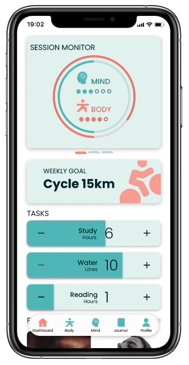
Homepage
Multiple iterations were made to the responsive dashboard, especially with the session monitor because of usability issues. These iterations resulted in improved usability with less guidance needed during onboarding.
1 Relocated Well-being monitor to the profile page so the user has one location to view their well-being progress
2 Redesigned Task tracking interaction which better meets accessibility requirements and inclusiveness
3 Added Weekly task to drive longer-term goals and install good habit production and reoccurring user base
4 Reduced the number of sessions tracked to 2 activities; Body and Mind for a simplified experience and infographic readability
5 Included a minus button in case of adjustment or error which was a strong suggestion made by the majority of usability test participants
6 Added metric labels to the tasks for clearer learnability, focusing on cross-cultural design these units of measurement can be adjusted in the user’s settings
7 Added interaction icon for increased learnability
A/B Preference Test
A preference test created on Usability Hub was completed by 20 participants to find out which design was preferred and to gather feedback on the ‘session monitor’.
The test indicated that a 65% majority preferred the design of Wireframe B.
A follow-up question “What made you choose that design?” gave insights into the participants’ choice and the feedback was used to further refine the design.


8 Redesigned data visualisation and added a key in response to participants being confused by the session monitor.
9 Improved hierarchy of copy with font size and weight to improve readability and learnability.
10 Adjusted colour scheme to meet WCAG 2.1 AA requirements with responsive copy elements requiring two background colours.
11 Colour introduced to icons to indicate the user’s location which will improve navigation across the platform.
Journal

Designing a journal page was a rewarding design experience, learning to balance information-rich content with a minimal design was a challenge. Design principles allowed me to develop a simple and effective solution with quick learnability.

1 Emphasis helped bring clarity and focus to the application’s buttons, I did this by using an orange colour, which is consistent throughout the app.
2 Unity helped bring consistency across the application with scroll indicator elements and corner radius’ on buttons. This helps users’ success rates with learnability and memorability.
3 Good continuation (Gesault Principle) contributes to creating a recognisable scrolling interaction so the user doesn’t need a scroll indicator.
4 Hierarchy was essential to give priority and readability to fonts and elements by using white space and different font sizes and weights for headers and body text.
Collaboration
Developing a network is important in having the opportunity to get feedback on planning and designs. Utilising this network, four designers offered feedback on the BALA prototype after initial testing.

1 YAEL “I would have preferred third-party buttons at the bottom of the page.”
Studies have shown increased conversion rates when social login is prioritised. No action is required.
2 ALEX “The X button isn’t functional.”
Exit buttons in the prototype have been linked to relevant pages.
3 BEN i ”I would like to be offered some suggested goals for inspiration.”
Exchanged the text input field for multiple-choice chips of inspirational goals.
4 YAEL “I got a little confused here and didn’t really understand what to do.”
The copy on the current day tab has been changed to ‘Today’, improving learnability and users immediately land on an empty card when initially landing on this page.
5 BEN ii “Text is too light to read.”
All wireframes meet WCAG 2.1 AA contrast guidelines. No action is required.
6 YAEL ”It’s hard to read the text on the image.”
Created a 40% gradient layer over the image for increased readability.
Handover
In preparation for a handover, this design language document was created to ensure consistency in style guidelines and elements for the next stages of the project and future iterations.

Move your way back to a healthy mind and body
Filter
Filtering the content for users, it allows users to quickly view tailored content relevant to their needs and increase value.

Journal
Allow users to journal and reflect on their physical and mental well-being which will result in positive reinforcement and habit forming.
Weekly Goals and Tasks
Help users stay motivated with a simple interactive dashboard and infographics to track their custom tasks and goals.


Easy Onboarding
Design a minimal onboarding experience to quickly access free content to experience the application’s value.
“I like that it is very user driven, what goal or how intense the user wants it.”
Participant #3


Prototype
Move your way through the interactive prototype
Sign in, explore the content and journal your wellbeing
Reflection
The BALA project was fun to learn the end-to-end process of user-centred design, it was the result of a do-as-you-learn approach on the Career Foundry UX|UI design programme, which made for lots of learning curves along the way with multiple iterations for usability and accessibility of designs and deliverables.
Using my skills in communication and effective feedback I quickly built good relationships with my mentors to fully benefit from their expertise and knowledge. A rewarding experience during the process was balancing and negotiating the needs of different stakeholders with different feedback by having regular stand-ups and reflecting on research data and insights.